Fuse Universal
Be Bold. Be Loud.
What is Fuse Universal?
Fuse Universal is a digital learning platform for businesses. They have always stood out in the market from a design perspective with their large type and bold use of color. They maintained that feel as part of a recent brand refresh they underwent with another agency that helped modernize and extend Fuse’s visual identity.
Role + Responsibilities
Freelance UX / Visual Design
Team
1 Visual Designer, 1 Art Director
Project Duration
1 month - 2021
I was contracted to work with The Starr Conspiracy (an experience agency) and one of their Art Directors to craft engaging and on-brand user experiences for their client, Fuse Universal. I was provided a creative brief, copy document, style guide, and brand assets. I was tasked with structuring content, wireframing, ideating, and designing two webpages for Fuse’s new brand launch. Since the The Starr Conspiracy handled client relations and approvals, there weren’t any challenges that arose from my end as the brief and copy document were very straightforward with the direction and deliverables needed.
Learn + Understand
Problem /
Fuse’s website has not been given the same attention during the brand refresh as some of their other sales and marketing material. Fuse did not feel like their current website truly aligned with the boldness and messaging of their updated identity. Nor did the website communicate effective calls to action to resonate and connect with their target audience.
“Fuse feels like their current website doesn’t truly aligns with the boldness and cleanliness of their updated identity. Nor does the website communicate the right message to resonate with Fuse’s targeted buyer that aligns with the Fuse way of approaching learning.”
Fuse’s Original Landing and Platform Page Design
Solution + Key Insights /
Provided creative direction for Fuse’s new homepage and platform learning page based on their new style guide, brand voice, and asset collection.
1 / Give the website a more clean yet bold aesthetic with new brand assets and adjust usage of background/ call out colors
2 / Increase visual impact of CTA buttons and key pieces of content
3 / Create consistent spacing throughout
Explore + Define
Structure + Hierarchy /
The process of structuring page content for their eLearning platform involved several key steps. First, I begin by sketching and wire framing rough ideas of the pages which allowed me to explore different design ideas and layouts without committing to a specific design.
Next, I focused on establishing a hierarchy of page content. I prioritized certain content elements based on feedback from The Starr Conspiracy team to create a clear visual hierarchy, making it easy for users to understand which content and action elements were most important.
While keeping in mind the needs of the target audience. This involves researching the demographics, goals, and expectations of the users who will be using the platform. This information is crucial in designing a platform that is user-friendly and meets the needs of its target audience.
Design + Iterate
Process /
Four rounds of iteration including the initial layout approval of the wireframes was and final design deliverables. Each round of iteration included minor adjustments to placement of illustrations and iconography and a few larger modifications requested around the placement and visual design of content sections.
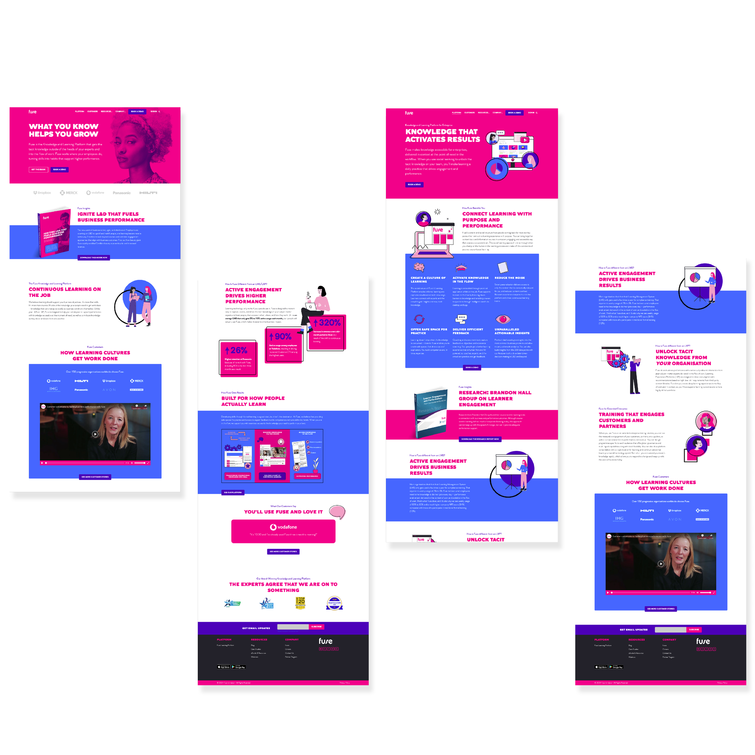
In regard to the homepage design, the goal was to have a clear call to action around acquiring new customers through free downloads of their ebook. This was prioritized by placing a secondary button in the hero banner as well as the placement of the first content section focusing on describing the value of the ebook with an additional CTA button.
Final Homepage and Platform Page
Impact /
With an emphasis on CTA placement throughout the site, Fuse saw roughly a 20% increase in audience engagement with downloads to their ebook, which was a key metric in their revamped customer acquisition strategy.
Evaluate + Advance
Outcome /
Overall, this project went smoothly and without any disruptions; mostly due to a well-defined brief, streamlined approval process and clear line of communication with The Starr Conspiracy. Designing the structure of page content for an eLearning platform was a meticulous process that involved careful planning and organization. By following these steps, I created a user-friendly and effective design that met the needs of the client for their target audience.
“The website layouts Mike produced look great! I can’t wait for the client to see the difference of where these two pages are now to where they will be after the update. I know they will be thrilled. Mike made some really great decisions throughout the process.”


